Gift Entry for Nonprofits
Reimagining gift processing for fundraisers
Role
UX Lead
Timeframe
June 2019 to March 2020
Work
UX/UI Design, UX Research, User Testing
The Challenge
I was tasked with improving the user experience for Batch Gift Entry, a Salesforce.org Nonprofit Cloud offering which helps fundraisers process their donations in bulk. Approximately 80% of all donations in the US are made by physical checks so for fundraising operations, this involves manual data entry to process gifts. The biggest pain points are around the speed and accuracy of this highly manual and paper-heavy data entry workflow.
In addition, the features of Batch Gift Entry were not intuitive and lacked the scalability and configurability to meet the user needs of fundraising teams ranging from grassroots organisations to international enterprises. It also missed the mark on supporting our growing base of higher education customers, who needed a gift entry form for processing complex gifts one at a time.
Discovery
Internal Interviews
User Interviews
Research Plan
Interview Protocol
I kicked off discovery with a series of both primary and secondary research activities. This included internal interviews with stakeholders across engineering, product, marketing and sales to understand their perspectives and goals for Batch Gift Entry. I also interviewed with Salesforce implementation partners, existing and prospective customers to learn more about their pain points, people, processes and technology for gift entry. To ensure I was capturing as many diverse perspectives (e.g. from small and scrappy fundraisers to highly technical, enterprise-level organisations) as possible, I produced a research plan and interview protocol to collect comparable feedback.
Contextual Inquiry
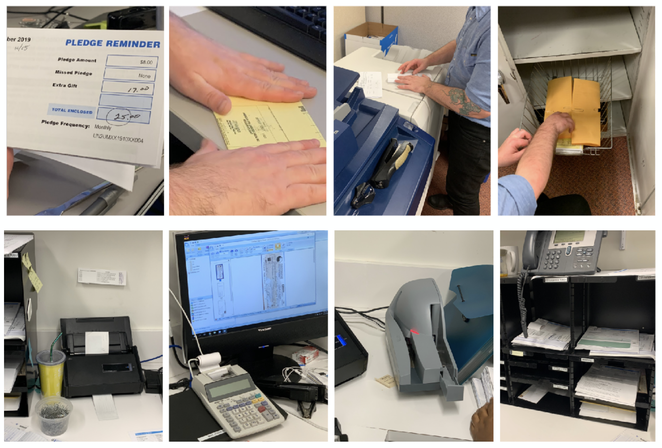
One of the most valuable interviews happened in person where I was able to act as a fly on the wall and observe the workspace, systems and actual process of entering gifts. This provided a lot more context into our user’s environment and workflow, many of which were physical elements like post-it notes, paper trails of cheques and checklists, and supporting devices like scanners and photocopiers.
The gift entry process is very analog and manual
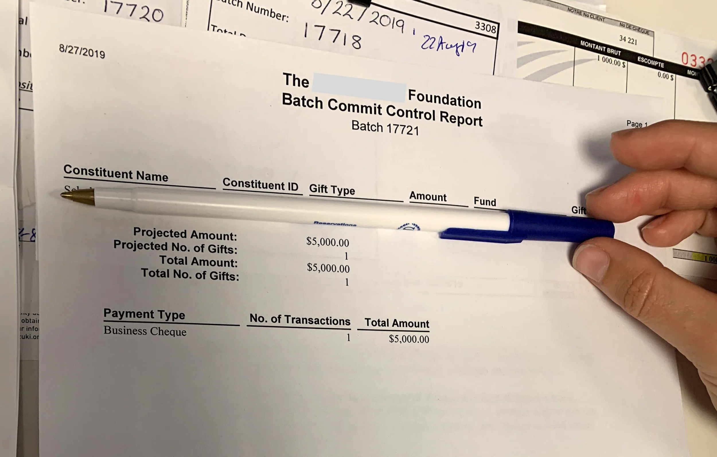
Example of a batch report
Heuristic Analysis
Another step of discovery involved a deep dive and evaluation of the existing Batch Gift Entry solution. This included a high level heuristic analysis which provided insight into existing usability concerns, pain points and areas of improvement.
Competitive and Market Research
I also reviewed and analysed existing market research to understand the direct and indirect competitors. Research findings and customer reports from past UX efforts were also studied to formulate a perspective on the current landscape.
Define
Journey Mapping
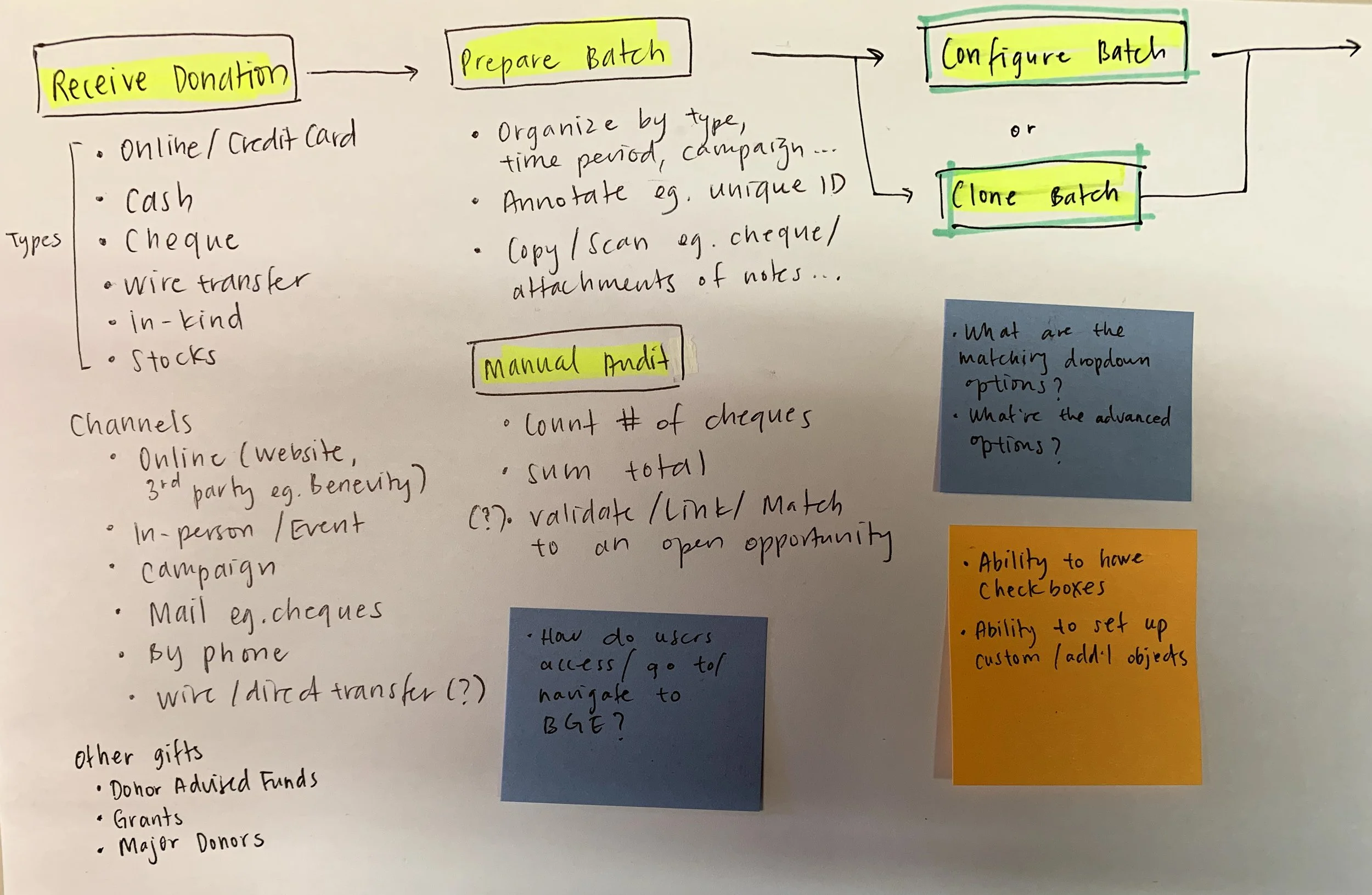
To converge on the discovery research and findings, I produced a journey map to capture our fundraiser’s gift entry process, highlighting the steps, activities, pain points and system considerations along the way. This was a helpful method to validate my perspective within the team as well as collect feedback and facilitate more empathy for our users.
A portion of the notes for the gift entry journey map
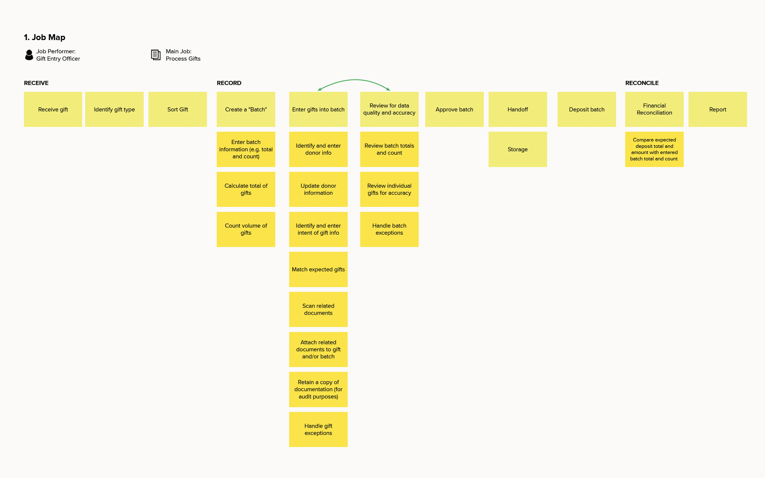
Gift processing job map
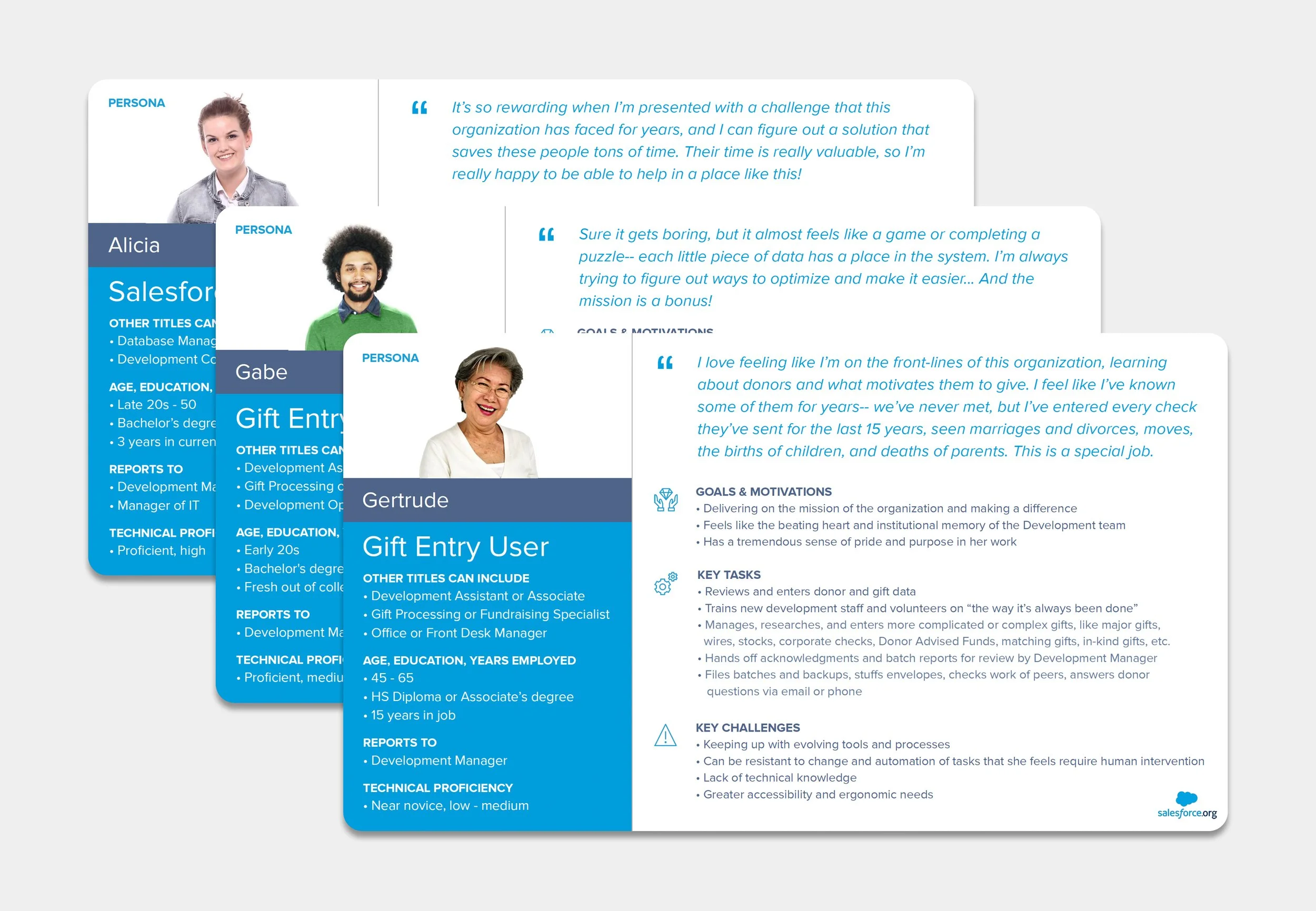
Personas
Jobs To Be Done
Through the user interviews, I unearthed a critical insight that would inform a lot of downstream design decisions. The existing Batch Gift Entry experience assumed multiple jobs to be done into a singular flow - combining the administrative, more technical, set up task with the actual data entry task. Most fundraising operations had separate job performers for the creation and setup of gift entry forms from the actual data entry user. The admin and gift entry user personas emerged. The timelines for these jobs also varied and certain decisions made during an admin’s form configuration should not be accessible to the gift entry user. Further findings from our researcher also confirmed these personas and identified other stakeholders like the Fundraising Manager and Accounting or Finance Manager.
Ideate and Test
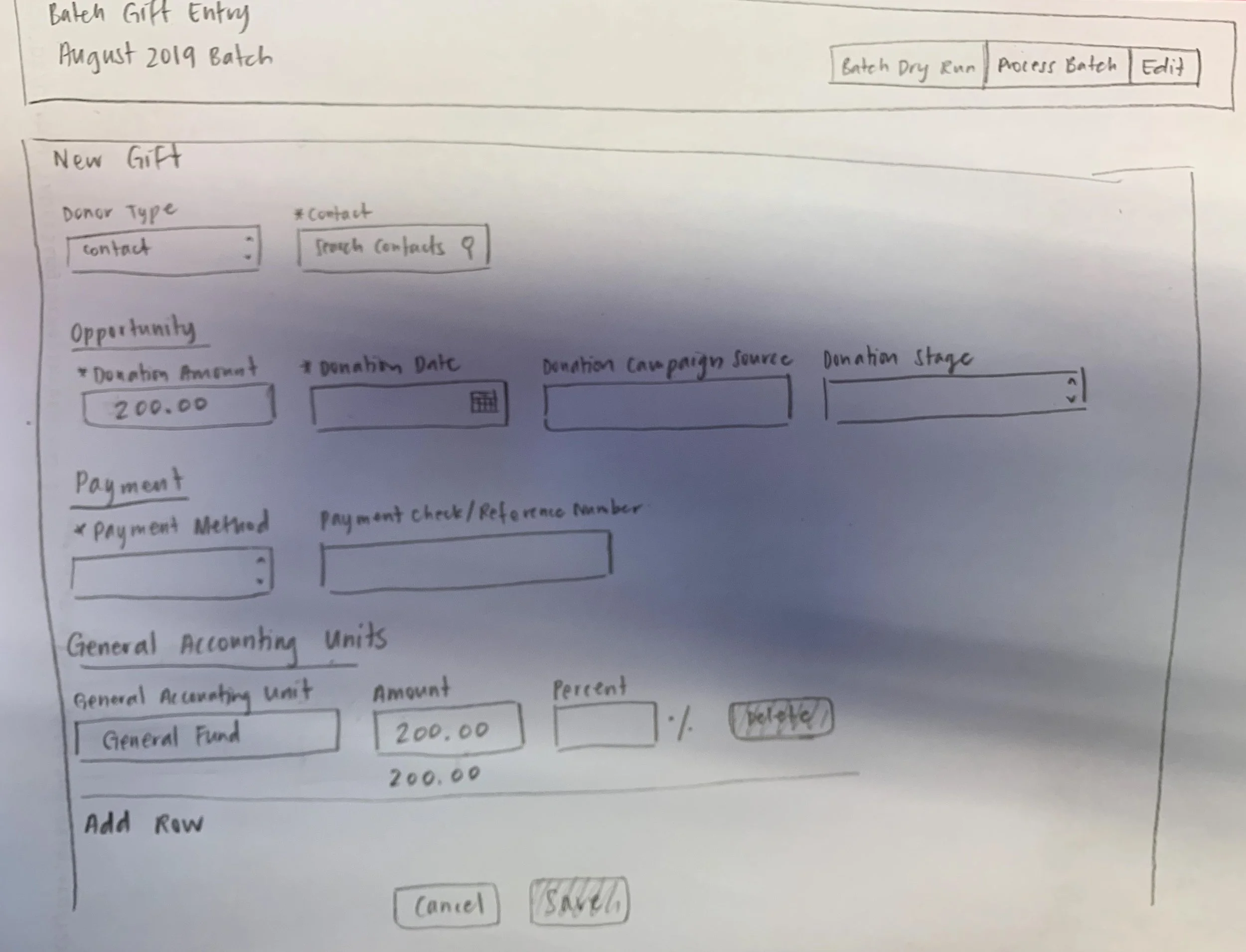
Sketching
Wireframing
Prototyping
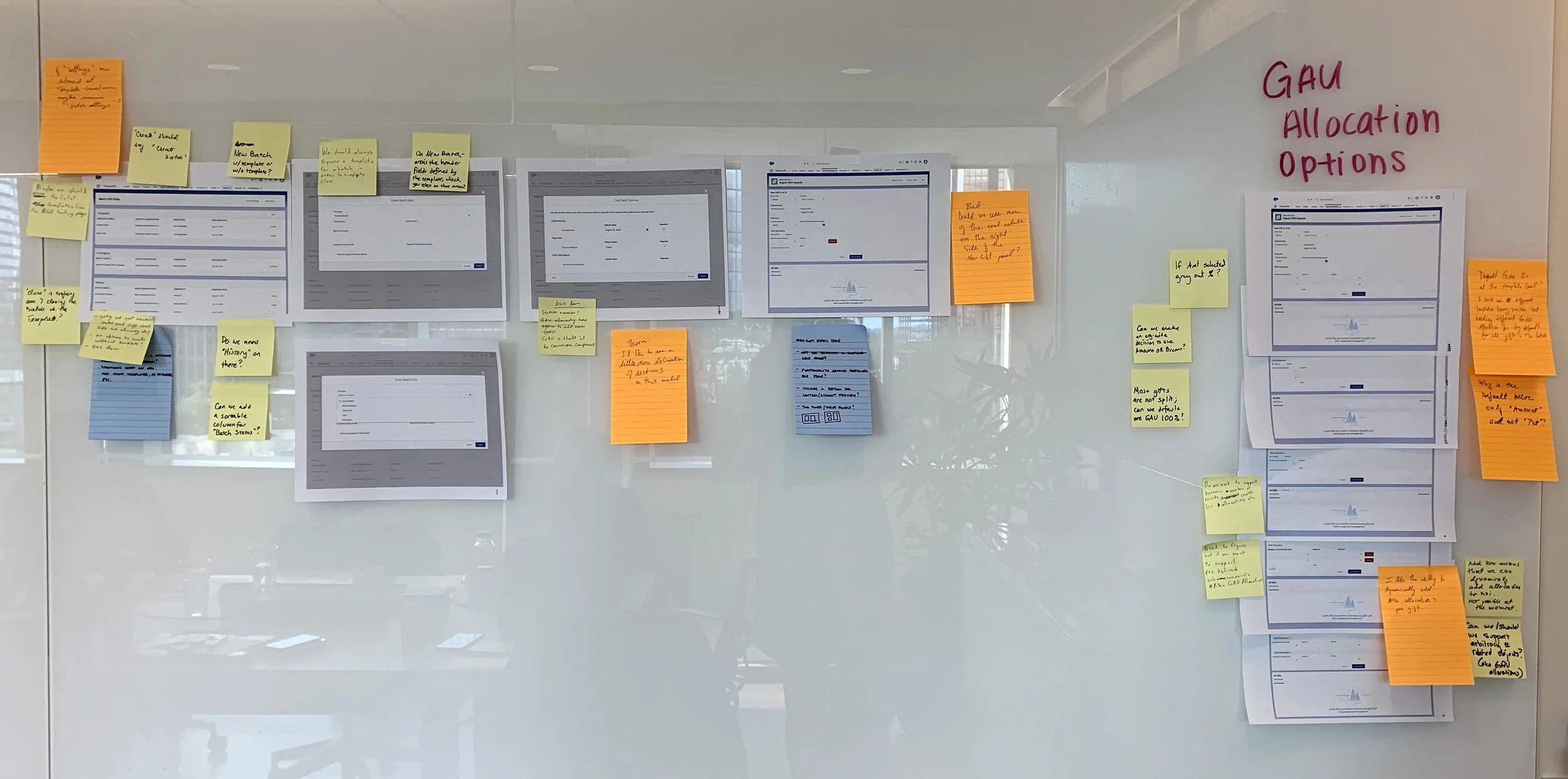
Design Reviews
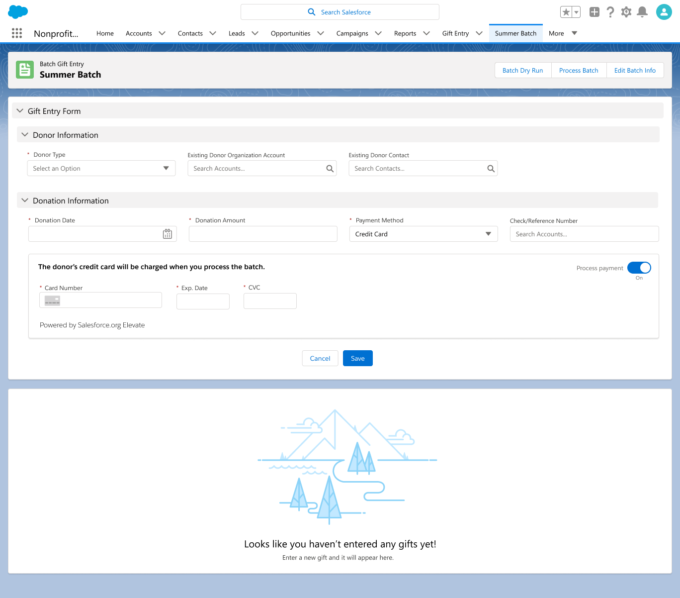
Ideation kicked off with a stronger understanding of our users and their gift processing needs. This phase involved many iterations of designing and testing, beginning with feedback from engineering and product for feasibility and viability of the proposed user experience. I started with simple paper sketches to quickly validate my concept of two separate user flows - one for the creation of gift entry templates and another for the actual data entry itself. This was followed by wireframing then higher fidelity prototyping with clickable screens and application of the Salesforce Lightning Design System (SLDS).
Low fidelity pencil sketches of the gift entry form
High fidelity mockup of the gift entry form using SLDS
Facilitating feedback from an in-person design review
Accessibility
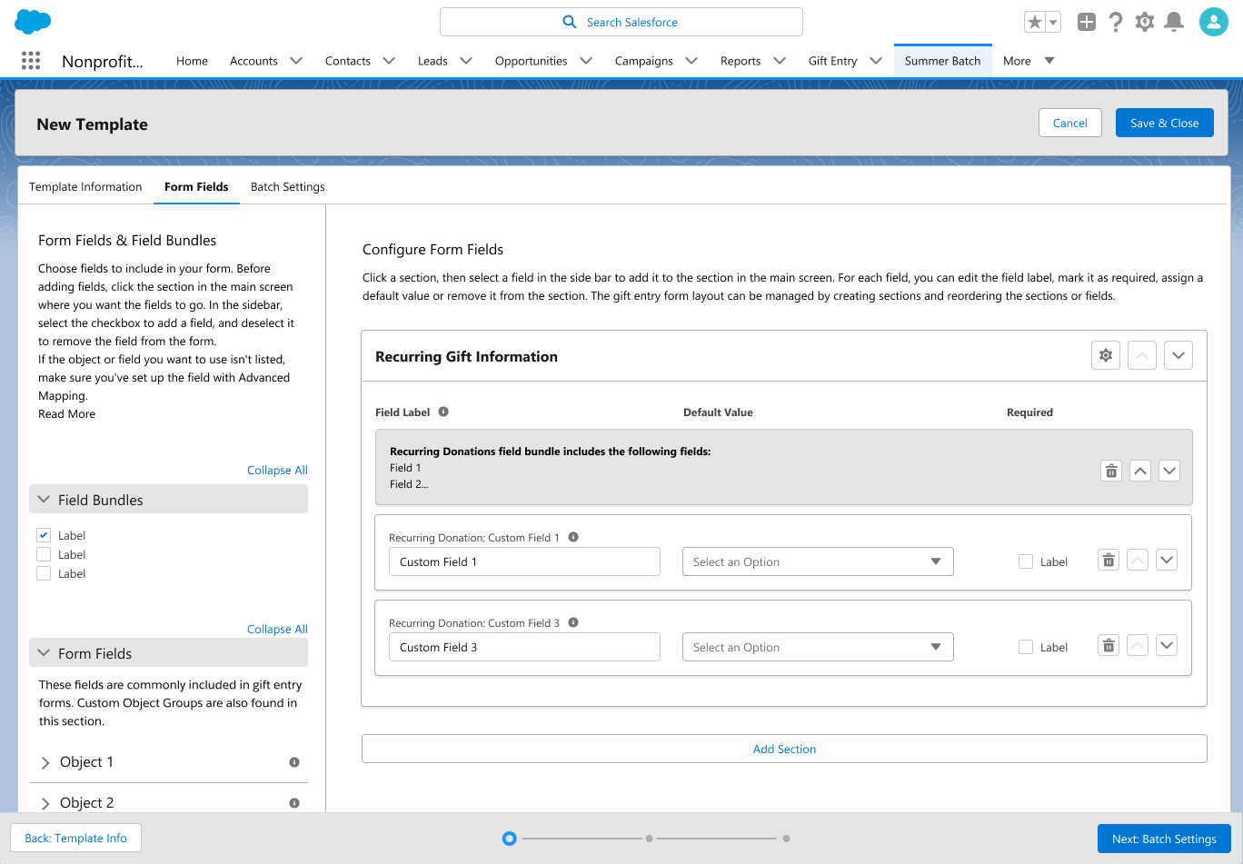
It was important for our team to ensure the solution we built would be one that is accessible to users of all abilities. Working closely with our quality engineering and accessibility champion, I learned that one of my design ideas involving a drag and drop template builder would have navigation challenges for screen readers. After reviewing and learning more about assistive technology and the Web Content Accessibility Guidelines 2 (WCAG 2), I recommended a user flow involving a menu of checkboxes that was not only more inclusive but also lower technical effort to build. I also ensured my designs adhered to the Salesforce Lightning Design System (SLDS) which contained accessible styles and patterns that were readily available for our engineering team to implement using corresponding Lightning Web Components (LWC). Not only does this champion design standardisation, it also avoids the need for high effort custom development.
The template builder features a lefthand menu of checkboxes for selection which can then be reordered according to its section(s) on the right.
User Testing
As the fidelity of my designs progressed, we were able to conduct multiple rounds of usability testing with customers and partners. The reviews’ feedback further improved the ongoing design iterations and informed decisions around information hierarchy, flow and UI layouts. It also provided our technical writers with valuable insight and understanding into intuitive user language for content and copy development across the UI and product documentation. Another added benefit was the empathy these user testing sessions facilitated as I encouraged our engineering team to participate and hear directly from our customers.
Implement
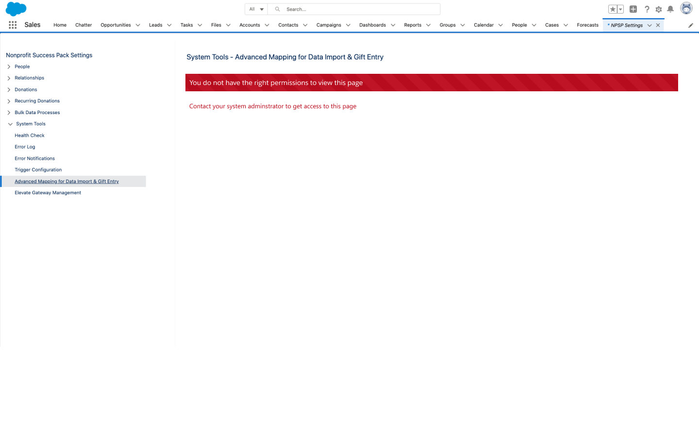
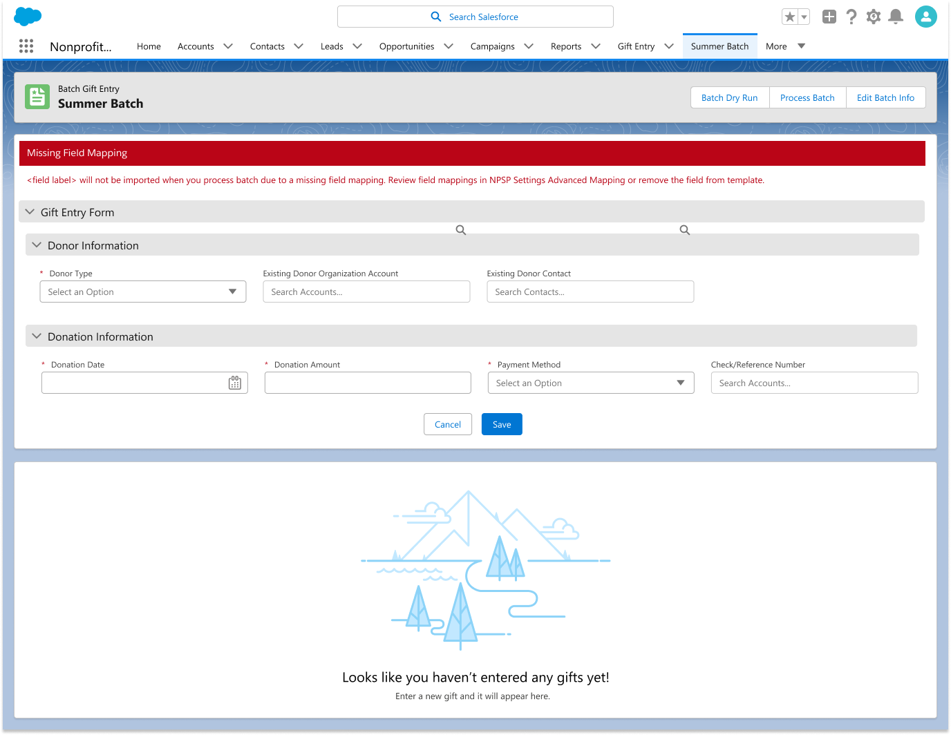
Once I delivered the designs, I continued to work with my scrum team to implement the user experience and advocate for our users as new considerations arised. This included UX recommendations and designs for error and edge case scenarios.
NPSP Settings Error
Gift Entry Form Error
Content Design
I also partnered with our technical writers to track and review the labels and alternate text proposed throughout the UI. No centralised resource existed for tracking custom labels as this information was either not documented or had only existed in functional silos. I led the creation of a standard tracker that facilitated collaboration across our developers, quality assurance, technical writers, accessibility and UX stakeholders to manage this content throughout the development process. This tracker was later adopted by another product in development.
Launch
Given the significant findings made during discovery and improvements recommended in the overall designs, our team decided to build a new product altogether rather than enhance the existing Batch Gift Entry solution. Our product, NPSP Gift Entry, became generally available in March 2020.
Continuous Improvement
Following the launch, I continued to work with the team to shape the product roadmap, recommend UX improvements and design product enhancements. Additional features I worked on include applying soft credits, donation allocations, recurring donations in gift entry, and integration with Salesforce’s payment processing platform (Salesforce.org Elevate).
User flow for creating recurring donations in Gift Entry
Component Library
From a design operations standpoint, I created a Gift Entry Library (initially in Sketch, then migrated over to Figma) to ensure the team and future collaborators would have access to the common components and patterns.
Results
The new solution is highly customizable, scalable and applicable across all fundraising organisations, meeting the needs of both nonprofits and higher education customers. Its success in adoption resulted in the sunsetting of its predecessors - Batch Gift Entry (BGE), Batch Data Entry (BDE) and Education Cloud’s Gift Entry Manager (GEM). As of January 2023, Gift Entry has been enabled on over 6.9k orgs (i.e. instances of Salesforce).
Patent Awards
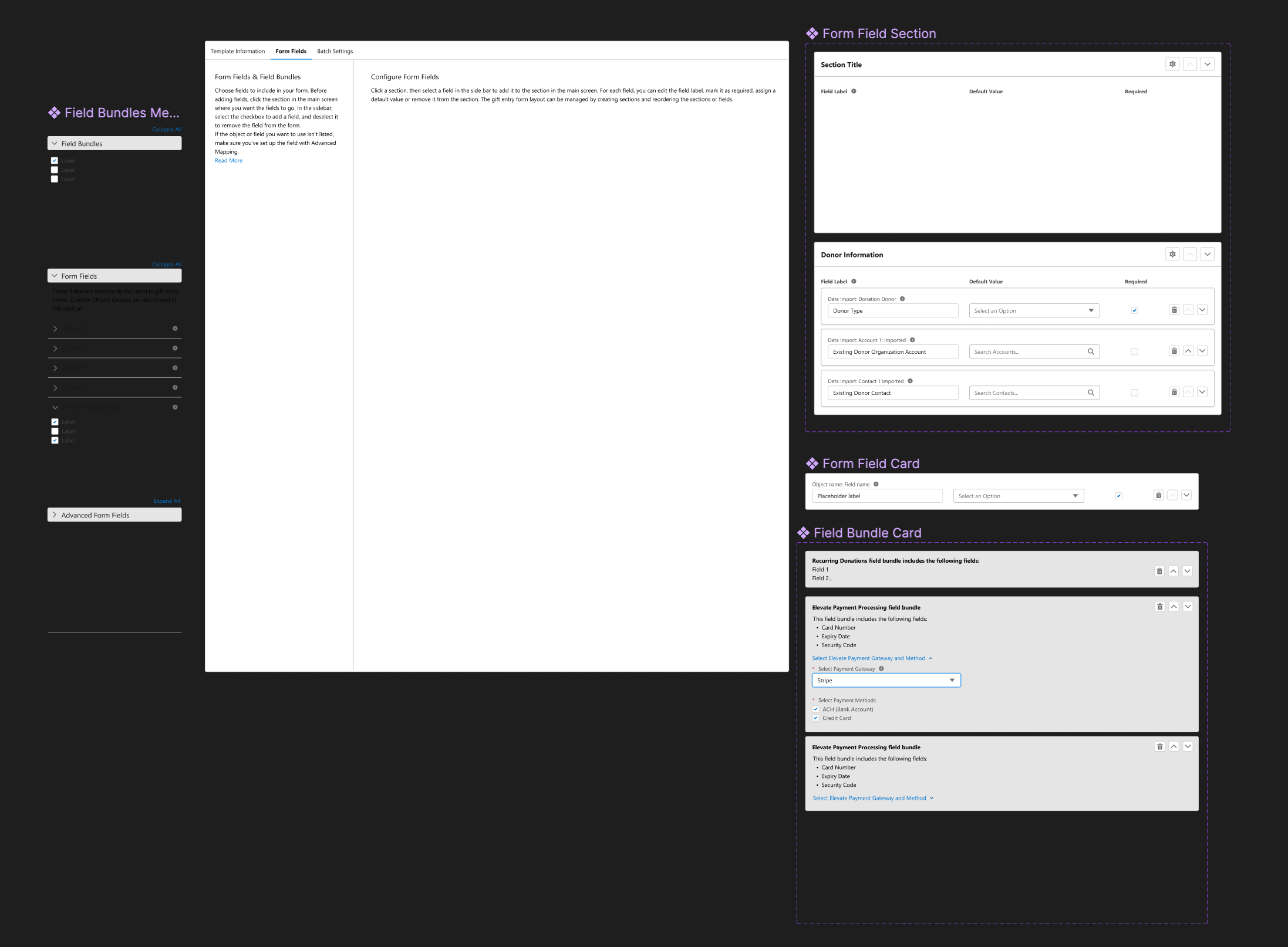
Our team was also awarded two patents in the design and technology of Gift Entry, resulting in recognition across the company as inventors.
Diagram of patented design from the Gift Entry template form fields screen
It was such a rewarding experience to lead the user experience and design of NPSP Gift Entry throughout the entire product development lifecycle. But this is what I am most proud of: our fundraising users can now save more time and improve their data accuracy during gift processing so that they can focus more on building relationships with their donors, deliver on their missions and do more good.
More information on how Gift Entry works can be found in Salesforce Help.
